Coming to America: The Extraordinary Journey of Morris Moel

ny-ah676_redlin_g_20100624180519

In my recent piece for the Wall Street Journal on the new museum for the Red Star Line, now under construction in Antwerp, I briefly mention the story of Morris Moel, 97, the oldest known immigrant to have come to America on the Red Star. As I wrote, his story is extraordinary in the way that many immigrant stories are. Moel arrived in 1922, after a harrowing trip across the Pale. Upon arrival, he moved to West Virginia, where his father already had a men’s shop, and later graduated from the University of Cincinnati medical school. He has lived in Florida since 1980, a retired radiologist. For the historical record, I thought it would be worth publishing a transcript of Moel’s accounting of his trip, as he told it to me.

Are you the last surviving member in your family to emigrate.
I’m the last one in our family living. I’m 97 years old. I was the youngest. So I lasted longer. I came over in 1922 on the Red Star. Four children and my mother. We came from the Ukraine, a little town called Lubar in the Ukraine.

What do you remember about your journey.
First of all, it’s a long story. My father was here [in the USA]. He came in 1913. We didn’t hear from him for many many years during World War I, and after this the revolution in Russia. Things were terrible. So we didn’t hear from my father for 12 or 13 years. We finally got a message. It came through from Warsaw, from HIAS, the Hebrew immigration society. So my mother went to Warsaw, she left us with my grandmother. She was there for two months, three months, and during that period my grandmother passed away, and my older brother who was 17 became our mother and father. And one winter day a big sleigh approaches the house and a man comes out and asks if we are the Moel family. “We’re here to take you to your mother.” Put on the warmest things you can put on. I wrapped all kinds of rags on my feet. We traveled to the Polish border all day and part of the night. This was I suspect some time in late winter. We got to this house near the border where we slept part of the night and we were awakened and we found this sleigh and were taken to close to the border and then walked to the border. The Russian part of the border was all forest. And we were stopped. I heard rifles being cocked while we were walking. Russian soldiers. And the soldiers searched everyone and took everything that was valuable and said you’ve got to go back, and I guess they [the guides] knew another route so we got through. And the Polish border was absolutely free, but it was all snow. I was so little and my older borther dragged me across that border. Finally we got to the other side inside Poland. Stayed in a house for half a night and we were then taken to a train station. And that train took us into Warsaw. The first time I was in a train. And my mother was waiting for us in an office. We told her my grandmother died. She never knew about it.

Continue reading Coming to America: The Extraordinary Journey of Morris Moel

Terminal City: I.M. Pei & Philip Johnson at JFK

terminal6pei pjunionterminal

There was a time—and this seems almost preposterous now—that the airport was a destination in itself, a place that promised the sexy modern lifestyle of the jet age. At an airport, you were going someplace—if not overseas than perhaps to some nearby hot-sheet with a swinging Braniff brunette in Pucci. (Score!) Joe Baum brought flaming food tableside at the Newarker, precursor to the Four Seasons. Raymond Loewy streamlined the so-chic cafes at Eero Saarinen’s TWA Terminal. It was quite a moment. And then the future happened.

I.M. Pei’s terminal for National Airlines at JFK [above left] came at the end of this romantic era. I spent many hours in it as a kid, waiting for flights to visit my grandmother in Miami. (National was big in the NY-Florida trade.) It’s a terminal for high traffic, and designed as such, with arrivals sent down below and departures in the signature upper space, a broad open room with glass walls and massive round columns outside. It’s a great building: technologically innovative, dramatic to be in. At least it used to be. (It’s not what it once was.) And now the Port Authority claims it’s no longer capable of handling JFK’s traffic, and they’d like to tear it down. Preservationists are giving them a fight. I hope they can find a way to integrate it into whatever comes next. Pei himself seems fatalistic about its future. “Like all things, buildings never remain forever,” he told me. It was his first and only air terminal, and a significant commission, as he won it in a competition, an affirming moment. “That was important in my life.”

Philip Johnson also submitted to that competition. His proposal [above right], called for a massive open concourse (he called it the “Great Room”) covered by a wavy concrete roof engineered by Lev Zeitlin. Unlike Pei, he intentionally chose not to segregate arrivals and departures, instead dumping them all into one chaotic space. “I am glad the genius who designed the Grand Central Station [sic] lets me come from the train into the same Great Room where others are about to en-train,” he wrote. “What good is a great getaway room if the visitor is not to see it?” A nice idea in theory, perhaps, but one can only imagine the carnage. The right design won the competition. Now it deserves a reprieve.

Oh, Culture: A Koons at the Seagram Building

woof

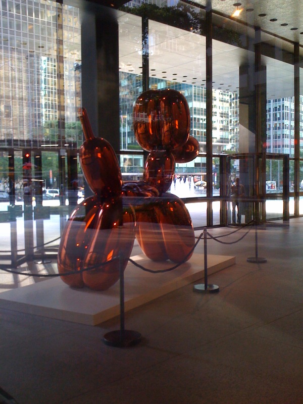
I imagine Mies would not have been pleased to see Jeff Koons’s kitschy pink balloon dog standing guard in the lobby of the Seagram Building, his masterpiece of pristine austerity. Philip Johnson? You’ve got to figure he would have smiled at the juxtaposition. It would work better without the plinth/velvet ropes, but there’s something about the object and its formal simplicity (prettiness?) that fits. If you were inclined, you could write a thesis on the nature of art, commerce, and cynicism inspired by the combination.

A largely unknown fact: Mies had actually planned to design a pair of sculptures to sit in the two pools in the plaza of the building, but eventually decided against. Just imagine a pair of Koons dogs in those pools, standing sentinel like Patience and Fortitude at the NYPL. For what it’s worth, here’s Susan Sontag (chief theorist of kitsch), and Philip Johnson (sometimes practitioner thereof) in conversation about the Seagram Building. Too bad they’re not around to comment today.

Walk the Walk, Take the Design

photo sagmeister-poster sagmeister-aiga-poster1

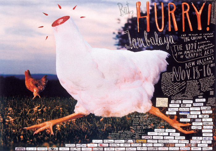
A few years ago I did an interview with ESPN magazine and was forced to subscribe to read the online version. Ever since, despite my cancellation order, the print edition, in all its oversized glory, has continued to foul my mailbox. Reading the latest, in spite of myself, I came across the ad above at left [click to enlarge], which has a small copyright notice for Abbott Laboratories. Being both lazy and busy, I haven’t made any inquiries, but let me just say I hope they’ve paid some kind of licensing fee to Stefan Sagmeister (or maybe he’s the designer—seems unlikely?), as this is a rather blatant case of borrowing from several of his signature pieces [ie: middle, right]. Either way, it’s pretty damn ironic that the phrase “ingenious design” is circled at the top right. AT&T’s recent Christo/Jean-Claude inspired tv spots, produced without the artist’s permission, indicate this kind of appropriation is becoming rather more common, which is disturbing, to say the least.

An Empire State of Mind

aiagide

Everyone seems to be weighing in with pieces on the new edition of the AIA Guide to NYC, which is as it should be; over on the website of Architect magazine, I take on the “lumbering dinosaur” that we all love so dearly, sometimes despite ourselves. Also on the subject of big cities, I have a piece in the new issue of Dwell introducing its cover package on the rise of megacities (alas, not yet online). Did you know there are over 75 cities with populations in excess of 5 million? Lewis Mumford, who thought the development of the megacity was a sign of the apocalypse, would probably not be pleased, but as someone who loves urban bigness—NY! Mumbai! Moscow!—I can’t agree. The issue also has a nice package by Karrie Jacobs on the urbanization of the highway system—something she’s been advocating for a while. Worth a read. With that, let’s close with the urban anthem of the moment, courtesy Hova:

One hand in the air for the big city,
Street lights, big dreams all looking pretty,
no place in the World that can compare,
Put your lighters in the air, everybody say Yeah.

Yeah.

Lady Di of 117th Street

diana

My first encounter with the work of Manfredi/Weiss came more than a decade ago, at a lecture at the Architectural League of NY attendant with their winning the League’s Emerging Voices award. They didn’t have a large catalog of built work—they were, indeed, emerging—but you could tell right away they were comers, and when I returned to Princeton Architectural Press the next morning, I suggested they’d be a good monograph subject. Eventually that happened, and so I’ve always felt an admittedly preposterous connection to the firm, though I never actually worked on their book, which was covered by another editor. One of the things that’s struck me about the two partners, over the years, is how they’ve always managed to play an active, progressive, and positive role in the life of the city and the profession without getting too caught up (at least so far as I know) in polemical and dogmatic michegas. And this attitude is pretty much reflected in their work, which fits so nicely into the city, while also being materially smart, a bit playful, and attuned to the lives of its users. Their new Diana Center up at Barnard may not be the next Ronchamp or Fallingwater, but on my first visit it seemed a welcome addition to the campus and the city. For what it’s worth, the new Moneo science center across the street (and peeking out to the right in the photo above) also looks like it’s going to be a winner.

BEA 2010: A Recap

typewriter

Abrams had the best installation at this year’s Book Expo America, a giant old-fashioned typewriter to promote a new photography book by Kevin O’Callaghan. Perhaps unintentionally, it suggested the central theme of the expo: obsolescence. The future of the book was, as per usual these days, on the minds of publishers and retailers. Based on my informal polling, publishers seem to be finding their feet (more hardcover sales this year than last, despite e-book encroachment), even as the ground beneath is shifting. It’s tougher for independent retailers. One publisher I spoke with suggested it would be a good idea to give independents a higher discount rate than the big chains—a nice idea, though I don’t know how realistic. As independents disappear, the rationale for BEA seems to be withering. This year the expo was effectively cut to two midweek days. Should it be open to the public on a weekend? I have no idea. Anyway, here are a few of the fall books I’ll be looking out for:

Robert Fossier, The Axe and the Oath: Ordinary Life in the Middle Ages (Princeton University Press). Just sounds cool.

Dietrich Neumann, ed., The Structure of Light: Richard Kelly and the Illumination of Modern Architecture (Yale Univrersity Press). Kelly did the lighting for many of PJ’s buildings, so I’m especially interested in this.

Alfred Crosby, Throwing Fire: Projectile Technology through History (Cambridge University Press). Nerd genius.

Boris Pahor, Necropolis (Dalkey Archive). The Holocaust memoir of the season. Dalkey is the little press everyone should know.

Massimo Vignelli, The Vignelli Canon (Lars Muller). A design manual by the grid god. Must have.

Patrick Dougherty, Stickwork (Princeton Architectural Press). You just have to see it. Trust me.

Gregory Crewdson, Sanctuary (Abrams). Crewdson’s pictures of the abandoned lots of Cinecitta. Your mouldering architecture photo book of the season.

Laurence Kardish, Weimar Cinema (MoMA/DAP). To accompany a must-see film series. My old schoolmate Josh Siegel’s Frederick Wiseman catalog (also MoMA/DAP) will be another keeper.

Ilyon Woo, The Great Divorce (Grove). My Oprah pick.

Jane Thompson & Alexandra Lange, Design Research (Chronicle). How modernism landed in the home.

It occurs to me now that I am legally obligated (?) to disclose that Woo and Lange are friends, and that I used to work at PAPress. I might be biased, but I still think they’re tops.

Ballet Schooled

promenade

The latest alterations to Lincoln Center were rolled out to the press at the end of last week. I wasn’t in attendance for the official ceremonies, but I’ve been spending some time at the center recently so can weigh in in a somewhat informed way. Basically it’s an improvement, except for the replacement of Dan Kiley’s grid of trees with the bizarre arborial moat that is the “Barclay’s Capital Grove.” The embedded LEDs in the new steps into the plaza look fine, and I concede WET’s fountain is pretty dramatic. Sinking the access road below grade is a huge plus.

But I think I’m burying the lede. The photo above of the State Theater promenade was taken last week during the intermission of a performance by the NYCB. It was a cold, rainy night, and there was nobody out on the terrace, so by all rights the promenade should have been packed. In good times (or when the Nutcracker is playing), you can’t even move on the promenade, it’s so crowded. But as you can see here, that wasn’t the case. It doesn’t look empty, but it’s disturbingly sparse. Crowds have been thin enough that the ballet actually reduced capacity in its recent renovation, and it did so by driving broad aisles into the theater’s orchestra seating. One of the wonderful quirks of the theater was that its orchestra had no aisles, which meant patrons had to climb all over each other to reach their seats. This was a pain in the ass, as Philip Johnson, its architect, knew, but it also created a wonderful sense of enclosed space and fostered a kind of community, especially among season ticket holders. So losing it was a real shame, and a bad sign.

It’s strange to see the ballet struggling when MoMA seems to be packing them in daily—they are such similar institutions, with such shared history and ideals. It would be neat if the NYCB could stage dances in the MoMA garden once in awhile, maybe set up a ticket program to attract some of the tourists who are probably going to see Broadway crap instead of dance. Maybe, in exchange, MoMA could borrow the ballet’s great Jasper Johns, which sits behind bullet-proof glass in its lobby. Nobody looks at it. Like the commercial says: two great tastes; go great together.

Meanwhile, City Opera is in dire fiscal jeopardy. Fixing up Lincoln Center is great, but if the institutions it houses can’t survive, that’s a problem design isn’t going to solve.

A couple of images after the jump.

Continue reading Ballet Schooled

Rubens and the Right

1

A couple of weeks ago I went up to Cambridge for a symposium on Rubens, hoping to catch up on the latest scholarship and check in with friends in the art history game. I wasn’t expecting to have my core beliefs about the painter challenged, but that’s what happened, though not until the cocktail hour at the event’s conclusion. It was then that I got to speaking with Jeffrey Muller, the eminent Rubens specialist from Brown, who told me that after years of studying the painter, he had recently reversed his thinking about him, concluding that Rubens was wrong in his political choices, that in aligning himself with Hapsburg Spain rather than the (theoretically) more enlightened Dutch republic, he’d picked the wrong side in the great political schism of his day. No one has written more eloquently than Muller about Rubens’s humanism, but now here he was, suggesting that this was just Rubens’s way of intellectually insulating himself from the ramifications of his actions as a propagandist for rightist power. I walked out in an unsettled state.

It’s nice to have one’s beliefs challenged, once in a while. That’s why events like this are worthwhile. That said, I don’t find myself swayed by Muller’s arguments. It seems to me Muller has created a false opposition between good and bad, when really the two sides were fighting over shades of gray, and those shades were especially muddled if you happened to be from Flanders, which was caught between them. How “liberal,” I’d ask, would Rubens have considered the Dutch in 1619, when Johan van Oldenbarnevelt, the deposed secularist leader of Holland, was executed by a right-wing coalition? Not very. We’ve come to think of this great battle between Spain and Holland as an ideological/religious fight of world systems, but it was driven equally—probably more—by competing economic and colonial interests. Which is to say, it was rather amoral. Rubens’s diplomatic activities, judged contextually, were generally progressive and almost always pragmatic; if he was conservative, it was in his advocacy for change from within a system rather than revolution from without.

This debate raises one of the central problems with Rubens; he has always been a figure onto whom ideas can be projected. In part this was intentional; some of his commissions (famously, the Medici series) were so politically delicate that he left their meanings opaque, so as not to offend any party. But this has left him subject to the vagaries of history. The Nazis loved him, nevermind that his entire diplomatic agenda was driven by a desire to cease wars of aggression. I took up Rubens with my own agenda. I began writing with the Iraq War at its nadir, when that nation was a land divided by sectarian violence, and occupied by a negligent foreign power. This seemed eerily resonant to Flanders in Rubens’s day, also a land of sectarian violence, and one with its own negligent occupant. Indeed, Antwerp had a Green Zone—a fortified area built by the Spanish to protect themselves from the locals. I tried to keep my political views out of the book, leaving them implicit. But given its genesis story, it’s interesting that some of the most positive notices have come from conservative publications. There’s a lengthy review, for instance, in the latest issue of the Weekly Standard. (More of a book report than a review, actually, but well considered.) Its appearance there, in any event, is a reminder that we all have a tendency to see what we want in art, and in Rubens in particular. I wonder what the Standard’s editors think about such a postmodern notion? Perhaps we can all agree on this: good art demands some tough thinking.

SOM: They’re #1

usaf

What is the top architectural firm in the United States? The friendly staff at Architect magazine established a set of criteria, surveyed the profession, and crunched the numbers. After all that scientific effort, they arrived at the same answer just about any sane person would have given them with barely a second thought: Skidmore, Owings and Merrill. Then they asked me to write the profile. (Warning: prose shading toward the hue of purple.) SOM, of course, has been the sine qua non of corporate design for three quarters of a century, “the Brooks Brothers of glass and steel,” as I write. They build, they plan, and they win awards by the cartload. The resources the firm devotes to technical research are prodigious. No one will build you a more elegant curtain wall, but that’s not where the practice ends. It’s hard to begrudge the firm its status, which seems rightfully earned, even if corporate design isn’t your cup of tea. And I suspect we’ll see them in the same spot next year.