BEA 2010: A Recap

typewriter

Abrams had the best installation at this year’s Book Expo America, a giant old-fashioned typewriter to promote a new photography book by Kevin O’Callaghan. Perhaps unintentionally, it suggested the central theme of the expo: obsolescence. The future of the book was, as per usual these days, on the minds of publishers and retailers. Based on my informal polling, publishers seem to be finding their feet (more hardcover sales this year than last, despite e-book encroachment), even as the ground beneath is shifting. It’s tougher for independent retailers. One publisher I spoke with suggested it would be a good idea to give independents a higher discount rate than the big chains—a nice idea, though I don’t know how realistic. As independents disappear, the rationale for BEA seems to be withering. This year the expo was effectively cut to two midweek days. Should it be open to the public on a weekend? I have no idea. Anyway, here are a few of the fall books I’ll be looking out for:

Robert Fossier, The Axe and the Oath: Ordinary Life in the Middle Ages (Princeton University Press). Just sounds cool.

Dietrich Neumann, ed., The Structure of Light: Richard Kelly and the Illumination of Modern Architecture (Yale Univrersity Press). Kelly did the lighting for many of PJ’s buildings, so I’m especially interested in this.

Alfred Crosby, Throwing Fire: Projectile Technology through History (Cambridge University Press). Nerd genius.

Boris Pahor, Necropolis (Dalkey Archive). The Holocaust memoir of the season. Dalkey is the little press everyone should know.

Massimo Vignelli, The Vignelli Canon (Lars Muller). A design manual by the grid god. Must have.

Patrick Dougherty, Stickwork (Princeton Architectural Press). You just have to see it. Trust me.

Gregory Crewdson, Sanctuary (Abrams). Crewdson’s pictures of the abandoned lots of Cinecitta. Your mouldering architecture photo book of the season.

Laurence Kardish, Weimar Cinema (MoMA/DAP). To accompany a must-see film series. My old schoolmate Josh Siegel’s Frederick Wiseman catalog (also MoMA/DAP) will be another keeper.

Ilyon Woo, The Great Divorce (Grove). My Oprah pick.

Jane Thompson & Alexandra Lange, Design Research (Chronicle). How modernism landed in the home.

It occurs to me now that I am legally obligated (?) to disclose that Woo and Lange are friends, and that I used to work at PAPress. I might be biased, but I still think they’re tops.

Ballet Schooled

promenade

The latest alterations to Lincoln Center were rolled out to the press at the end of last week. I wasn’t in attendance for the official ceremonies, but I’ve been spending some time at the center recently so can weigh in in a somewhat informed way. Basically it’s an improvement, except for the replacement of Dan Kiley’s grid of trees with the bizarre arborial moat that is the “Barclay’s Capital Grove.” The embedded LEDs in the new steps into the plaza look fine, and I concede WET’s fountain is pretty dramatic. Sinking the access road below grade is a huge plus.

But I think I’m burying the lede. The photo above of the State Theater promenade was taken last week during the intermission of a performance by the NYCB. It was a cold, rainy night, and there was nobody out on the terrace, so by all rights the promenade should have been packed. In good times (or when the Nutcracker is playing), you can’t even move on the promenade, it’s so crowded. But as you can see here, that wasn’t the case. It doesn’t look empty, but it’s disturbingly sparse. Crowds have been thin enough that the ballet actually reduced capacity in its recent renovation, and it did so by driving broad aisles into the theater’s orchestra seating. One of the wonderful quirks of the theater was that its orchestra had no aisles, which meant patrons had to climb all over each other to reach their seats. This was a pain in the ass, as Philip Johnson, its architect, knew, but it also created a wonderful sense of enclosed space and fostered a kind of community, especially among season ticket holders. So losing it was a real shame, and a bad sign.

It’s strange to see the ballet struggling when MoMA seems to be packing them in daily—they are such similar institutions, with such shared history and ideals. It would be neat if the NYCB could stage dances in the MoMA garden once in awhile, maybe set up a ticket program to attract some of the tourists who are probably going to see Broadway crap instead of dance. Maybe, in exchange, MoMA could borrow the ballet’s great Jasper Johns, which sits behind bullet-proof glass in its lobby. Nobody looks at it. Like the commercial says: two great tastes; go great together.

Meanwhile, City Opera is in dire fiscal jeopardy. Fixing up Lincoln Center is great, but if the institutions it houses can’t survive, that’s a problem design isn’t going to solve.

A couple of images after the jump.

Continue reading Ballet Schooled

Rubens and the Right

1

A couple of weeks ago I went up to Cambridge for a symposium on Rubens, hoping to catch up on the latest scholarship and check in with friends in the art history game. I wasn’t expecting to have my core beliefs about the painter challenged, but that’s what happened, though not until the cocktail hour at the event’s conclusion. It was then that I got to speaking with Jeffrey Muller, the eminent Rubens specialist from Brown, who told me that after years of studying the painter, he had recently reversed his thinking about him, concluding that Rubens was wrong in his political choices, that in aligning himself with Hapsburg Spain rather than the (theoretically) more enlightened Dutch republic, he’d picked the wrong side in the great political schism of his day. No one has written more eloquently than Muller about Rubens’s humanism, but now here he was, suggesting that this was just Rubens’s way of intellectually insulating himself from the ramifications of his actions as a propagandist for rightist power. I walked out in an unsettled state.

It’s nice to have one’s beliefs challenged, once in a while. That’s why events like this are worthwhile. That said, I don’t find myself swayed by Muller’s arguments. It seems to me Muller has created a false opposition between good and bad, when really the two sides were fighting over shades of gray, and those shades were especially muddled if you happened to be from Flanders, which was caught between them. How “liberal,” I’d ask, would Rubens have considered the Dutch in 1619, when Johan van Oldenbarnevelt, the deposed secularist leader of Holland, was executed by a right-wing coalition? Not very. We’ve come to think of this great battle between Spain and Holland as an ideological/religious fight of world systems, but it was driven equally—probably more—by competing economic and colonial interests. Which is to say, it was rather amoral. Rubens’s diplomatic activities, judged contextually, were generally progressive and almost always pragmatic; if he was conservative, it was in his advocacy for change from within a system rather than revolution from without.

This debate raises one of the central problems with Rubens; he has always been a figure onto whom ideas can be projected. In part this was intentional; some of his commissions (famously, the Medici series) were so politically delicate that he left their meanings opaque, so as not to offend any party. But this has left him subject to the vagaries of history. The Nazis loved him, nevermind that his entire diplomatic agenda was driven by a desire to cease wars of aggression. I took up Rubens with my own agenda. I began writing with the Iraq War at its nadir, when that nation was a land divided by sectarian violence, and occupied by a negligent foreign power. This seemed eerily resonant to Flanders in Rubens’s day, also a land of sectarian violence, and one with its own negligent occupant. Indeed, Antwerp had a Green Zone—a fortified area built by the Spanish to protect themselves from the locals. I tried to keep my political views out of the book, leaving them implicit. But given its genesis story, it’s interesting that some of the most positive notices have come from conservative publications. There’s a lengthy review, for instance, in the latest issue of the Weekly Standard. (More of a book report than a review, actually, but well considered.) Its appearance there, in any event, is a reminder that we all have a tendency to see what we want in art, and in Rubens in particular. I wonder what the Standard’s editors think about such a postmodern notion? Perhaps we can all agree on this: good art demands some tough thinking.

SOM: They’re #1

usaf

What is the top architectural firm in the United States? The friendly staff at Architect magazine established a set of criteria, surveyed the profession, and crunched the numbers. After all that scientific effort, they arrived at the same answer just about any sane person would have given them with barely a second thought: Skidmore, Owings and Merrill. Then they asked me to write the profile. (Warning: prose shading toward the hue of purple.) SOM, of course, has been the sine qua non of corporate design for three quarters of a century, “the Brooks Brothers of glass and steel,” as I write. They build, they plan, and they win awards by the cartload. The resources the firm devotes to technical research are prodigious. No one will build you a more elegant curtain wall, but that’s not where the practice ends. It’s hard to begrudge the firm its status, which seems rightfully earned, even if corporate design isn’t your cup of tea. And I suspect we’ll see them in the same spot next year.

The Outlier: Philip Johnson’s Tent of Tomorrow

img_1587

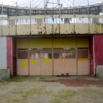
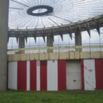
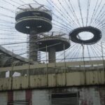
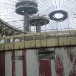
The latest World’s Fair, Expo 2010, opened earlier this month in Shanghai. The US entry is pretty weak (someone, and I can’t recall whom, recently commented that it looks like a Lexus dealership). More impressive is Thomas Heatherwick’s British pavilion, a giant acrylic dandelion known as the “Seed Cathedral,” which stands as one of the more fantastic architectural projects of recent memory. What will come of it when the Expo closes, I have no idea; some World’s Fair monuments hold up better than others. With that in mind, I took a ride out to Flushing Meadows over the weekend to check in on New York’s vision of tomorrow, circa 1964—or at least Philip Johnson’s interpretation thereof. The future, alas, isn’t what it used to be, and it hasn’t been for some time.

Johnson’s New York State Pavilion is in all ways an outlier. Physically, it’s removed from the city center, out past LaGuardia along the Grand Central. Aesthetically? Johnson went through many styles in his career, but there’s nothing in his catalog—or anyone else’s—quite like this. Its three disk-capped towers are most familiar from the climactic scene of Men In Black, in which they transform into flying saucers and are blasted away by Will Smith. Today, they still look like torched aliens—the whole project is a mouldering wreck from another, distant place. Those idiosyncratic towers, now rusty and inaccessible, once held observation decks and restaurants. They were actually late additions to the project, included because Nelson Rockefeller, then governor, wanted his contribution to be the tallest in the fair. The ovular pavilion itself, known then as the “Tent of Tomorrow,” was a rather butch structure, given its seemingly festive, lightweight function. (And inasmuch, akin to its erstwhile neighbor, Shea Stadium.) Sixteen massive cast-concrete columns, each over 100 feet high, were topped by a steel frame and cable system designed to carry a colored plastic canopy, now missing. Without the plastic canopy, the cable stays and their ocular pendant give the disconcerting impression of a looming, visionless eye. Beneath this cyclops, on the ground, is a mosaic map of NY (sponsored by Texaco) at present invisible through the rubble and weeds. The whole thing cost an enormous fortune, something on the order of $15 million.

Last year, the pavilion was granted landmark status, and there are theoretically plans at some kind of restoration. Gilmore Clark’s Unisphere, which is just a few hundred feet away along an axial pathway, has been kept up, and is now incorporated into the National Tennis Center. Johnson, for his part, didn’t mind that the pavilion was a wreck. “It’s rather nice,” he said. He always liked ruins. (His Glass House was inspired by visions of them, but that’s another story.) On Sunday, cricketers playing on the adjacent field made no acknowledgment of its lumbering presence. But two strolling tourists walked by, looked wonderingly over the construction fencing, and took a couple of pictures. Then they moved along. It was a chilly afternoon.

A few more shots follow.

Dandies at the Ballpark

item_14271_1

What, you ask, did the well-dressed gentleman wear to the ballpark in 1870? The sartorially inclined team outfitter might have turned to the lovely “New York Fashions” lithograph above for inspiration. Tastes have changed—you won’t catch today’s big leaguers in baggy flannel—though not that much. The proto-hipster bearing the scarlet letter of the Brooklyn Atlantics (third from left) would fit in nicely in contemporary Williamsburg, what with his slouchy cap, mutton chops, and disaffected expression. The $13,000 this print pulled at auction this week, however, is probably out of range for the typical resident of that neighborhood. Something, anyway, to chew on.